

STS Palast


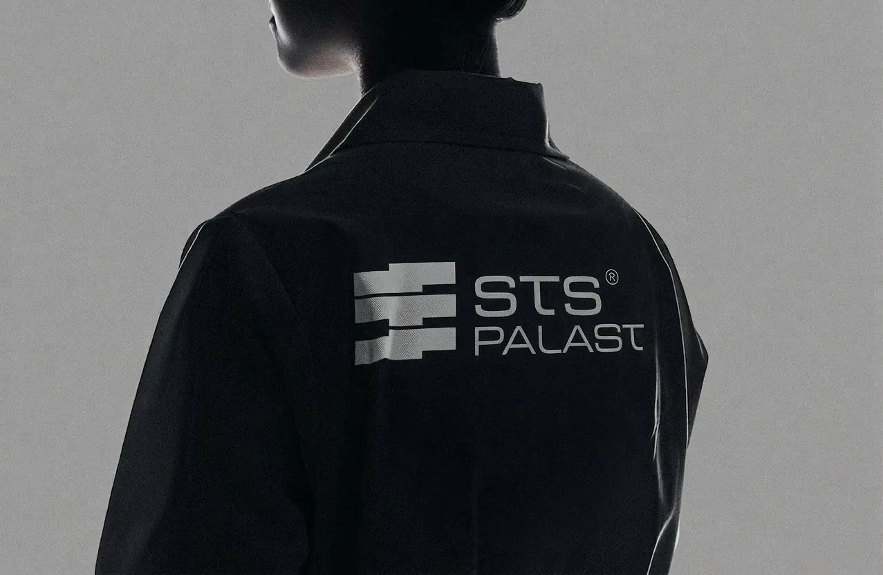
STS Palast is a luxury construction company from Vienna with an engineering-first approach. ZEMN Design built its brand like a structure: a heavy modular mark, a concrete and steel palette, extended type and a clear voice, all documented in one brand guideline. We also consulted on the website design. The result is a construction brand that looks as solid and precise as the buildings it delivers.
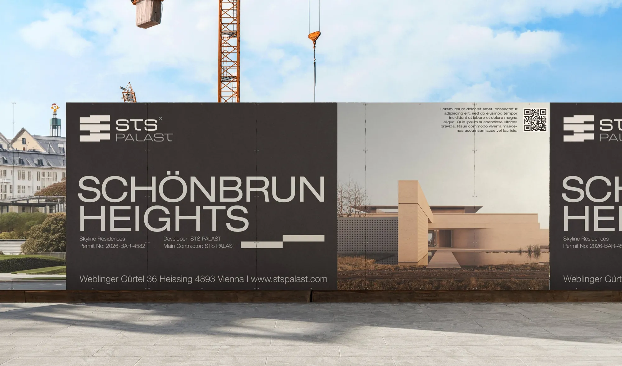


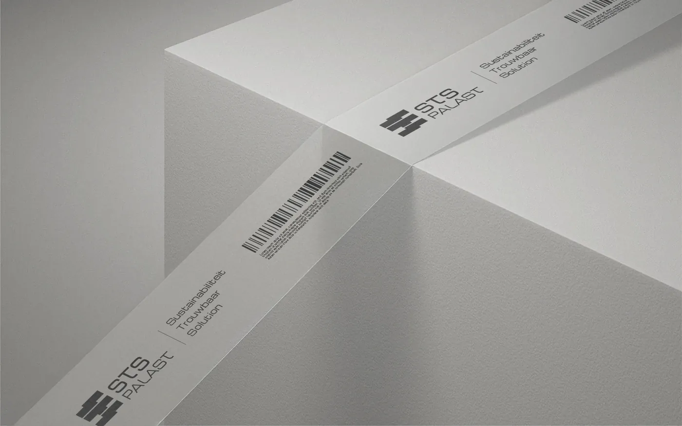
We started with how STS works: engineering first, with a system for safety, budget and time. We turned that into a brand platform with a story, mission, vision and three values: Sustainable, Trustable, Solution. Then we designed the identity to match. The logo is a stack of interlocking blocks inspired by Brutalist architecture, with a clear system of symbol, wordmarks and rules for size, clear space and misuse. The palette uses two tones taken from concrete and steel. The type pairs Michroma with Helvetica Neue Extended. Photography follows strict rules: low angles, calm people and clean, controlled scenes.
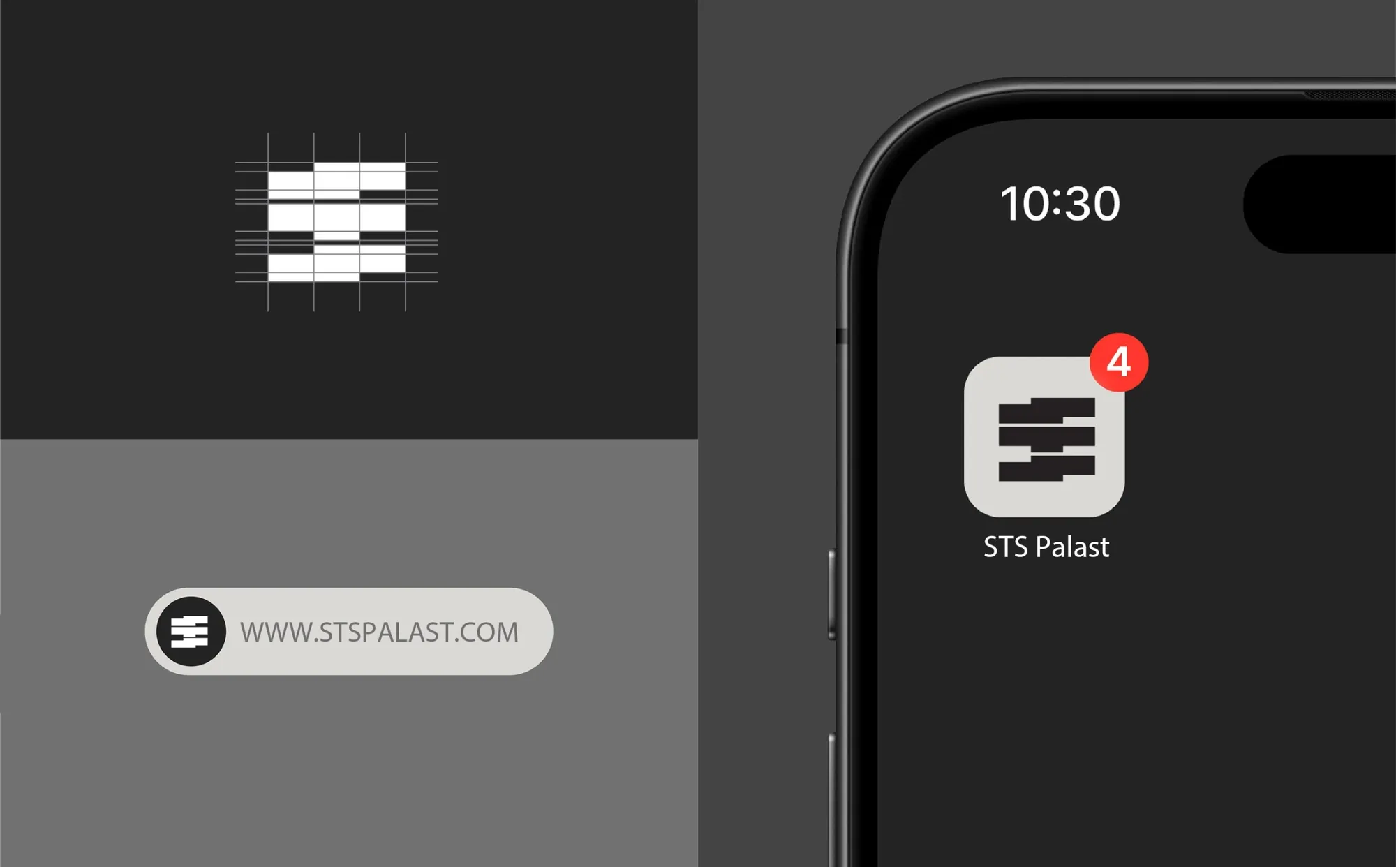

Brand platform (story, mission, vision, values, goals), logo system with symbol and wordmarks, color palette, typography system, photography direction, verbal identity with archetype, promise and tone of voice, brand guidelines, application mockups and a website design consultation.
STS Palast builds high-end homes and commercial landmarks, and it competes on precision and trust, not on price. The brand had to look as solid and exact as the work. It also needed a system that every future vendor, printer and team member could follow without guessing. The identity had to work in two worlds: refined corporate documents and rough site environments.
• Brand platform: story, mission, vision, values and goals • Logo system: full logo, symbol and two wordmarks • Rules for minimum size, clear space and logo misuse • Color palette in Westar and Atomic Grey, with tints for layout depth • Typography system for headings, titles and body text • Photography direction: low angles, calm and confident people, clean scenes • Verbal identity: archetype, brand promise and tone of voice • Brand guideline document • Application mockups • Website design consultation
This project shows how ZEMN approaches branding for construction companies: a clear position, a mark that works on a site sign and a proposal, a restrained color palette, and written rules for logo, type, photography and voice. The same method applies to builders, general contractors and engineering firms. Client: STS Palast, Vienna. Website: https://www.sts.co.at/
Q: Do you design brands for construction companies? A: Yes. STS Palast covers brand platform, logo system, colors, type, photography direction, voice and guidelines. Q: Why does a construction brand need guidelines? A: Trucks, signs, proposals and websites are made by many people. Guidelines keep them all looking like one company. Q: Can the logo work on a jobsite sign and a small icon? A: Yes. The identity includes a symbol-only version for small uses and clear rules for size and spacing.


